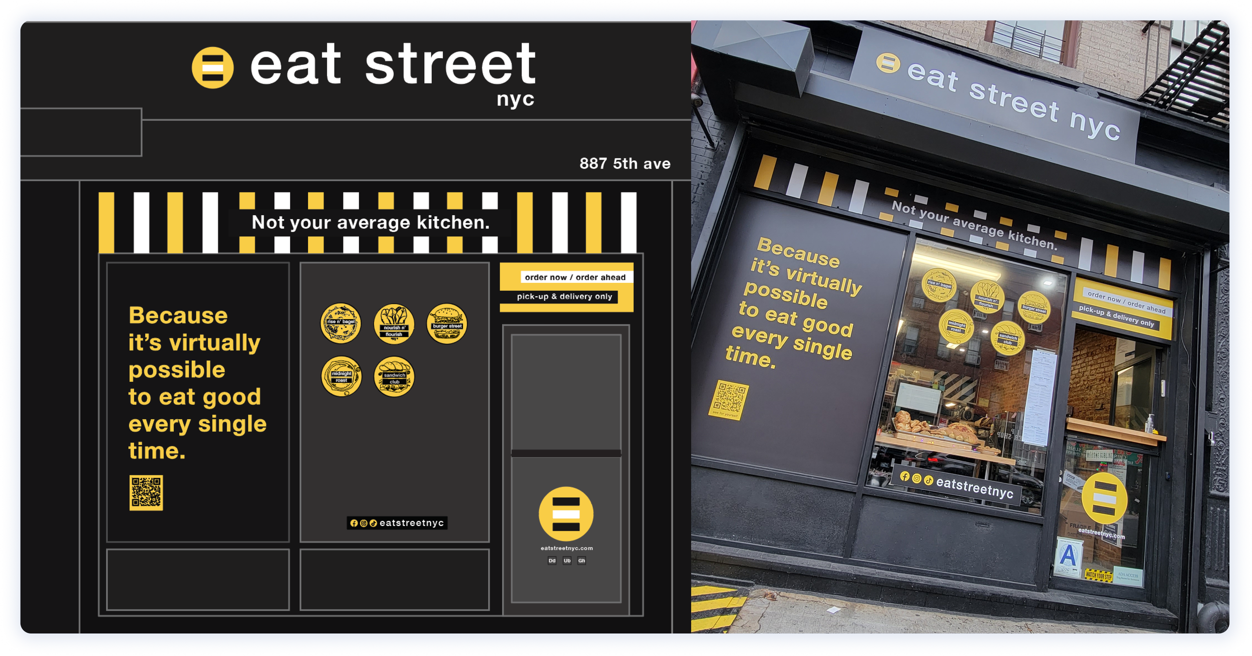
Building and designing an urban inspired to-go kitchen in the heart of Brooklyn
Eat Street NYC | F&B| Design, Marketing, Operations Consultant
Approach
As a brand design and marketing consultant for Eat Street NYC, I covered branding, menu naming, marketing, messaging, and operations.
Our main focus was on crafting an 'insta-worthy' brand identity, boosting awareness, and building trust in the foodie community. I dedicated efforts to strategically position Eat Street NYC as the go-to catering kitchen, fostering overall business growth.
Branding
Store-front design
Brand + marketing messaging
Web design + marketing collateral
Social media, ads + content creation
Ongoing optimization
Growth marketing
Operations + integrations support
Personality + Messaging
Eat Street NYC was founded on the idea of simple, accessible food that brings people together. Our goal is to emphasize community rather than making you feel obligated to align with the brand.
Our value proposition? Traditional flavors with a trendy twist, without the wait. Scratch made multi-concept kitchen + catering. Because it’s virtually possible to eat good every single time.
Value-driven Mission
In crafting the brand strategy for Eat Street NYC, the voice is one of enthusiastic wit with a dash of sarcasm, creating an entertaining yet honest.
We’ve aimed for a conversational and inviting atmosphere, where the messaging is persuasive, engaging, and transparent.
The approach was to sound trustworthy and genuine, leveraging our experience to communicate in a concise manner.
Eat Street NYC mission is grounded in one simple belief and that is to make their customer’s journey not just enjoyable, but authentically delightful.
Strategy & Concept
In shaping the brand strategy for Eat Street NYC, the vibrant color palette of yellow, black, and white takes inspiration from the energetic hustle of New York City. Incorporating lines reminiscent of crosswalks and circles embodying the NYC subway branding, our design elements mirror the urban dynamism. The typography, utilizing Helvetica Neue, exudes a sleek and modern aesthetic.
Photography is curated to emulate user-generated content, capturing moments with quality yet maintaining an authentic and community-driven vibe. This approach fosters a sense of connection and relatability.
To infuse playfulness, charisma, and an industrial feel, menu concept logos adopt a chalkboard look and feel. This not only adds a touch of whimsy but also reinforces the brand's commitment to delivering a diverse and quality culinary experience.
Overall, the brand identity is meticulously curated to be sharp, edgy, crisp, and clean, echoing the essence of Eat Street NYC as a culinary hub that effortlessly blends authenticity with a modern urban charm.
Look around some more
Corvus Visual Identity, Design Language, UX


